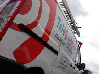
Market research had identified this as a key strategy to enable them to approach and operate in new markets and to give the company a clean, professional and easily identifiable look.
After much deliberation (talking with biscuits and several cups of coffee actually!) we decided to see if there was a way to integrate the key elements of a telephone and a CCTV camera within the design and then it was a light bulb moment - the telephone can be the "c" and the camera can be the "o"- Genius!! (well someone has to say it)
We use Adobe Illustrator to design and construct all of our brands, not exclusively but as it is a vector program it makes it a lot easier to enlarge the brand to whatever size is required for printing purposes. (this tip of the day is brought to you by the Mako Vector doctor)
The client was absolutely thrilled, to say that we blew his socks off was an understatement!
We are so pleased that the client was happy, very happy client = very happy Mako!
- it makes it all worthwhile :-)
 |
| New Branding |
 |
| Eye catching graphics on rear |
 |
| Clean, bold and distinctive |
 |
| Who you gonna' call? |
This is a very good information you have posted. The content are very easy to understand and is remarkable. I would like to know more about Catalogs and business printing also.
ReplyDelete